To gain inspiration for my own branding I began by looking at other peoples work, this varying from business's, catwalk fashion invites, actual swing tags, adverts etc.
Stripped
back branding for new fashion label.
Inspires me:
By keeping it simple but effective with use of tones and shades. Little
features such as envelopes and small stamps are what I find most interesting as
they hold the customers focus without going overboard.
Inspires me:
Keeping it natural and effective. By using cotton and basic fabrics is really
appealing to me, I think I could use old pattern paper to create something
similar to this, as well as luggage labels and envelopes.
Inspires me:
Fabric within a smart envelope, simple yet effective.
I want to
include fabric within my swing tags, I may heat transfer patterns, maps or
collage images onto the fabric, quite like the vintage pilots. During the war
the pilots would use fabric maps instead of paper in case they were to get wet
and the maps therefore ruined. I think it would be nice to continue this
detail/idea within my branding.
Inspires me:
Small detail but really effective.
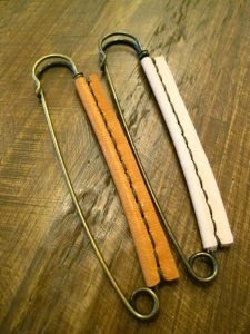
I plan to
use this detail within my branding, I would stich on matching fabric to my suit
fabric and use retro/vintage safety pins, maybe even spraying them a different
colour e.g. pastels or navy.
Inspires me:
Keeping the logo/design with bags, hangers etc.
Burberry is
quite classic and sophisticated, I like the used of brown paper bags as well as
a small ribbon. I think it looks classy and would appeal to both men and women.
After my initial research I created a mood board on photoshop of my idea's which I had gained from the research.
Next was to collect materials and idea's for my personal branding development.
List of
materials I could use:
Brown Labels
/ Envelopes
Old maps and
newspapers
Vintage
books / old pages
Retro Stamps
and ink to hand stamp
Vintage/
Antique pins and safety pins to attach fabric
Fabric
swatches; natural such as calico, cotton, wool, natural velvet
String and
cotton
Old tickets,
betting slips
Graph or
tracing paper
Ribbon,
zips, buttons etc.
List of
techniques I could use:
Illustration
Collage (by
hand or photoshop)
Heat
transfer
Laser
cutting
Embroidery
Paint such
as watercolour
Engraving
Laminating
Plastic
wallets to iron creating small trapped items e.g. dried flowers
Sewing
(small pouches out of fabric)
| Photographs of my collected materials |
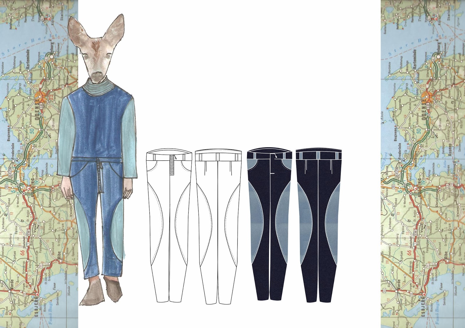
I then began to develop my idea's, I sketched out ten idea's I wanted to experiment with:
Now was to start experimenting..
For my first branding sample, I began with a
vintage looking image of graph paper on photoshop, I began adding layers of a
vintage blue chair (as that’s my colour theme) then a vintage images of a plane
(as aviation is my sport), next I added the BRC text as an abbreviation of
British Racing Company. Then I had the idea of animal heads to feature in my
portfolio, I really like the effect and how it adds something quirky to the
looks, therefore I added the model and the deer head to his shoulders. I have printed
this onto brown sugar paper creating a smart yet retro/vintage overall look, I
also used a small square of cotton and overlocked it into a pouch shape that I
could then place this swing tag into. I really love this sample and plan to
continue working into it further which could result in this being my final
branding idea.

My next sample logo, was a combination of scanned in fabrics and photoshop. I have used a vintage seaside family photo aswell as my nan & grandad on their wedding day, to create a vintage looking swing tag. I liked on the seaside image allowed the colour blue to come across strongly therefore showing my colour story as well as collaging on photoshop so I could use a image of a plane just very faint in the background. I stuck to a light white smart text as I want it to feel sophisticated as well as vintage. I'm really happy with this logo&plan to use it for the final one.
I have heat transfered both of the logo's onto natural calico which I plan to fold up into small envelopes made from vintage maps. The calico samples are shown below aswell as in my sketch book. I printed both as I wanted to see which I preferred.
Sample of handmade envelope.
To hang the fabric filled envelopes I'm going to use a decorative saftey pin therefore I have created a few samples of what I like. My favourites are the embroidery threads wrapped round and the small stamped calico.
I have also created a few glass bottle samples, I like how they have a 'message in a bottle' theme however in terms of practicability if the bottles were to smash or break it would be a in-convince and probably put the customer off from buying, as if could show low quality if the bottle was easily damaged, therefore maybe giving the idea the suit was of low quality to.
Aswell as using CAD in branding designs, I needed to include more CAM to do this I decided to create a sample of the embroidery machine, I kept the logo designs quite simple by using a map outline and the BRC initials in my chosen font.
As this was just a sample the colours didn't really matter however if I was to use this technique in my final branding idea's I would ensure the embroidery was completely black.
For my final swing tag and label I am using the heat transferring CAD images technique onto calico which could then be stitched or pinned onto the garment, I will place the swing tag into a small envelope made out of a vintage map and attach with a cotton wound safety pin.


.JPG)
.JPG)
.JPG)
.JPG)