Theme:
Is the theme vintage, modern, quirky, how can you describe it and link it to the
collections and/or website.
The
theme in this video is very characterised and quirky, the bag and bag charms
that are being advertised are the most featured product in the short film, as
if they are finger puppet characters (that bag charms have small faces on each
with a different emotion). I think the fashion film has a very homemade feel
about it even though Fendi is a quite highly priced designer brand.
Mood: How does it make you feel when
you are watching it Can you describe the emotions it portrays?
The film
makes me feel almost childlike, I think it is very fun and creative yet
advertises the products well by almost creating a story around each bag charm.
I think there is something very ‘cute/sweet’ about the whole mood of this film.
Music: What style of music is it and
can you link it to the collection?
The
music used is very retro almost circus like, it is quite upbeat and exciting,
as if you are waiting for something fun to happen. The music reminds me of
children’s adverts or television programmes. The tone of music changes
depending on the ‘Buggies’ characteristic’s and image shown in front, for
example when the ‘bag buggie’ is under the sea, the music is made to feel
almost muted as if you are under the sea personally. The is also small sections
of nursery rhymes played during the female ‘bag buggie’ section as well as
reference to the Moulin Rouge.
Setting: Where is it set, is it indoors,
outdoors, is in in urban setting or countryside? Is it in a busy space or an
abandoned derelict area?
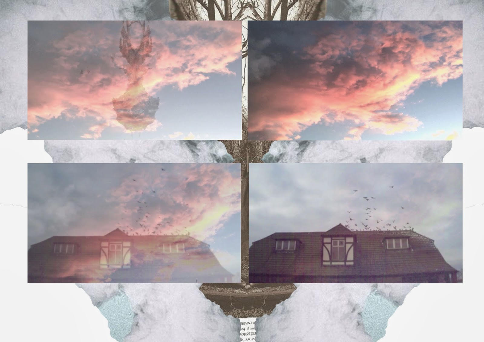
The set
is indoors in a vintage/retro looking home, with homemade screens/pop up
scenes, almost as if you are playing with a pop-up book with a child. The
setting is changed by the use of each screen but the overall background remains
the same, this being the home wallpaper & lighting on the dressing table.
Garments: Can you link the garments to an
era or a specific style. Are the garments their collection or are they vintage?
Or is it customised.
The use
of garments is quite subtle, the female model is wearing just a plain t-shirt
to keep all the attention focused on the ‘bag buggies’, the is also an almost
aggressive looking bag at the end but in terms of actual garments the only one
featured is the plain T-shirt as the ‘buggies’ are bag charms.
Colour: Are the colours bright, dull,
monochrome, bold?
The
colour theme is quite retro, with the use of vintage tones and primary colour’s
such as mustard and burgundy.
Lighting: Is the lighting harsh or soft,
are images projected onto props or models, if so what are they?
The
lighting is very crisp and exact, there is not a certain light highlighting a
certain section just the whole advert is well lit. I think the two lamps either
side of the screens are to give the illusion that they are lighting the whole
‘buggie show’, therefore lighting the advert, once again creating a very retro
and homemade feel.
Content: What is the video based on, is
there a story (narrative) within the video? Does it link to the collection, if
so how?
I don’t
think there is one consistent story, more about what the ‘buggie’s’
personalities are shown in small stories/sequences. I believe this is to
advertise a certain ‘buggie’ to a certain consumer with similar personality
traits (for example romantic, funny, interesting) inspiring the consumer to buy
something that could be considered personal to them, just in a less obvious way
than having their name embossed on a bag.
Imagery: Is there any imagery that links
to the collection or such prints or patterns? Does any of the imagery relate to
the overall story?
The use
of still imagery would be the backdrop scenes used to create a story with the
bag charms. This does relate as is the main narrative and overall story.
Model: How does the model reflect the
collection or the brand?
There is
not a model as such, in terms of faces etc. all we really see of the model is
their hands. By not showing what sex the model (although the hands look quite
feminine) it could allow the consumer to know that the products is not aimed
directly towards a particular gender. I do think the ‘bag buggies’ could easily
be unisex.
Styling: What is the make-up and hair
like, is it a specific style or dramatic?
For
model styling the viewer does not see the face or hair, the only styling is the
plain navy t-shirt. I think this is purposely done to show that an outfit can
be completely made by an exciting choice of bag. After all the advert is
promoting just bags and charms, not a complete collection.
Timing: Is the pace slow or fast, has it
been speeded up.
The
speed of the advert is consistent and keeps an almost relaxing rhythm, just as
if you are watching a short novelty show at home.
Technique: Have they used any special
techniques such as stop frame animation?
Not in
this advert no, they have kept it very simple but effective, almost like a
homemade family video, captured by chance.
Text: Is there any, if so how is it
used within the video. What style of font has been used? Does it reflect the
mood of the collection?
The only
text used is ‘Fendi Bagbuggies’ wrote in italic almost childlike text at the
very end just to allow a consumer to identify the brand and collection.
Props: Do they have any, if so are
they props subtle or a bold statement, do they make a statement? Do they
have animals in the video, this could relate to your sport?
The
whole advert is mainly props from fans, to lamps and drop screens (almost flash
card looking). Although they are not overstated the props keep a very distinct
feel, quirky feel to the advert.
Prints: Are they used within the
backgrounds or projected, do they link to the collection?
No
prints are used other than an old looking printed wallpaper used as a
home/living room backdrop.
Accessories: Are there any hats, bags,
helmets, watches, jewellery, shoes, glasses etc, do they relate to the theme?
The only
accessories shown are the promoted products themselves (these being the ‘bag
buggies’ and one handbag).
Fendi's
Bag Bug invasion
Fendi is preparing to welcome some furry friends
for Fall/Winter 2013-2014 in an animal invasion that will soon be crawling all
over this season's bags and accessories. That's right, it's the return of Fendi's
Bag Bugs, the cute little multicolored fur characters that are big on
personality. Coming to a Fendi store near you in November, the n...
Fendi is preparing to welcome some
furry friends for Fall/Winter 2013-2014 in an animal invasion that will soon be
crawling all over this season's bags and accessories. That's right, it's the
return of
Fendi's
Bag Bugs, the cute little
multicolored fur characters that are big on personality. Coming to a
Fendi
store near you in November, the new
Bag Bugs are set to star in short
film, to be unveiled exclusively on Vogue.fr November 4.
By Eugénie Trochu, translated by Kate Matthams-Spencer


.JPG)
.JPG)
.JPG)
.JPG)


